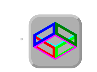
Adapting a 'codepen' icon made with CSS

I adapted a 'codepen' icon made with CSS made of rectangles made with 'clip-path', with the sides rotated to form a cube. Some of the sides are moved to the front with 'translateZ'. I colored the sides to see how it works: 'codepen.io/Bert-Beckwith/pen/jENyyaK' This is a different way of making a cube. Another way is to rotate 'div' elements. Maybe there is a bug with Chrome: sometimes the sides of the cube disappear if I change the background color of their container. The sides reappear if I click the icon. I tried reflowing the cube, adding 'z-index' and adding '!important' but these did not fix the bug. It is best to use SVG's for icons but I learn about CSS and my old browser does not show SVG's in HTML pages.


